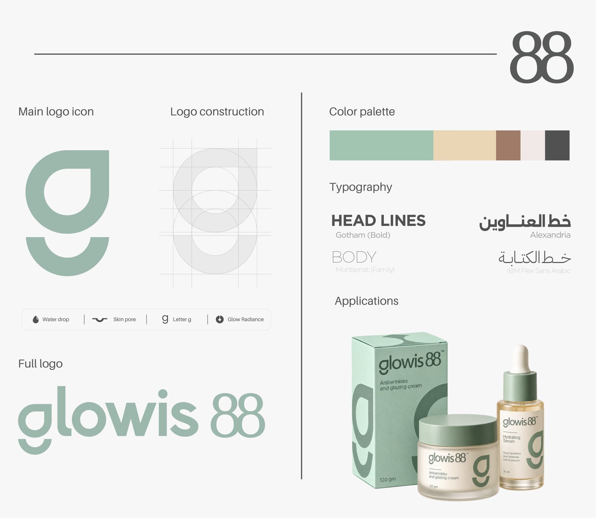
Glowis 88 is a skincare brand about hydration, radiance and natural beauty. We designed an identity that feels modern, elegant and approachable, and connects every element back to the product and the name.
The icon combines a water drop and a curve inspired by skin pores to form the letter g, linking the symbol directly to the brand name. In the 88, negative space suggests shine and glow.
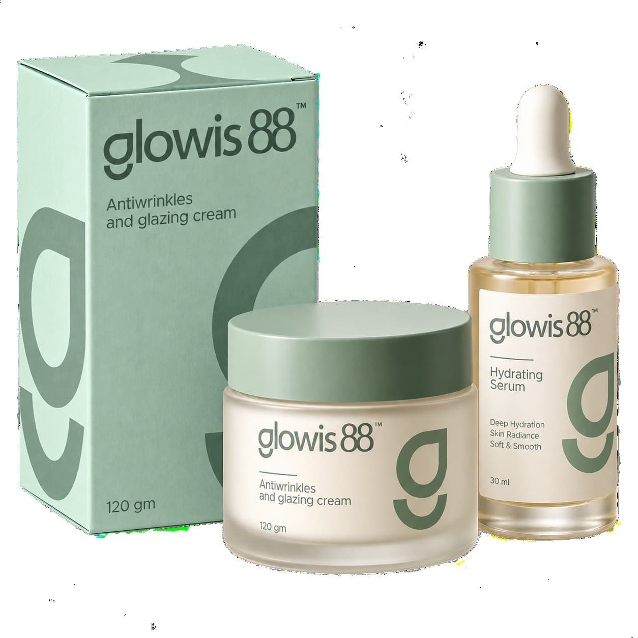
Soft sage and sand tones, clean typography and organic forms communicate hydration and purity. Headlines use Gotham Bold and body text uses Montserrat, with Alexandria and IBM Plex Sans Arabic for Arabic. The identity is applied across packaging for the cream and serum range.